UX for the reset button
The reset button is very, very close to the click-wheel (and is same color as the faceplate). It is easy (as my son demonstrated last night) to bump the reset button when doing a filament change. It would be good if the reset had the X filled in in black or something to make it stand out as a button.
RE: UX for the reset button
You should be able to, if you want it, color the 'X' black or any color using a small indelible marker, or even fill it in with about anything of a contrasting color.
RE: UX for the reset button
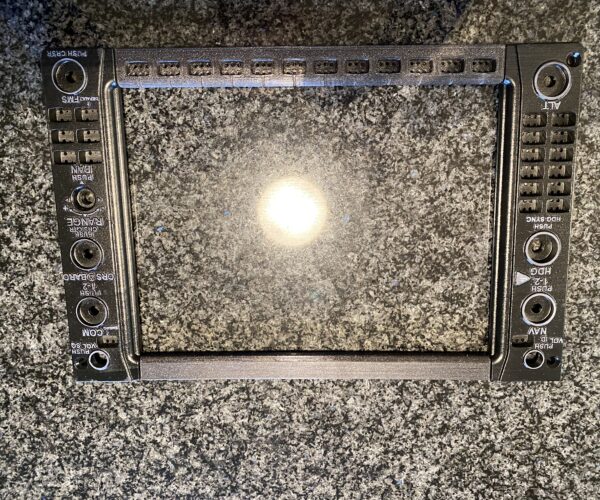
That’s a good point, but feedback to the company for UX is always good. I will note, since everyone probably is picturing a 10-year-old making that mistake, but my son is a commercial pilot. So A) he is very careful at pressing buttons and B) he presses buttons all day with cryptic labels and this confused him, so I’d say that’s a problematic UX. The problem is “X” is not obviously reset (on windows that is the “delete” icon) on an airplane they put a label on the face of the rotary encoder knobs so you know it is clickable (my printers spend the majority of their time printing flight simulator parts so I have seen a LOT of knobs (like I will fill in the imprinted text with white acrylic and sand off the surface (on the real planes I think it’s an enameled label) or I print the knobs in white PLA/resin with the letters proud and then spray it black and a light sanding of the letter tops leaves crisp white text (that glows if you illuminate from below). that was a test frame for the garmin g-1000 glass cockpit primary flight display. I did a much higher quality print later (as there is a fair amount of learning with a working print like this (particularly elephant foot compensation). When the backlighting turns on the letters look amazing! For the “X” I do have fine point black acrylic paint markers.
RE: UX for the reset button
Maybr reprint the front panel with a small hole (right size for a straightened out paperclip) where the button is. Almost no modern electronic devices have a readily accessible reset button.
