what is the font of the PRUSA logo?
Hoping someone can tell me what serif font is used in the PRUSA logo. Searching the forum didn't result in anything for me. The website is just "open sans", I don't know if that's used in the logo.
Re: what is the font of the PRUSA logo?
Freesans bold is close.
Re: what is the font of the PRUSA logo?
Freesans bold is close.
Thanks. Looks better than Liberation, at least. I'll print with that and post here when I have 'em done.
Re: what is the font of the PRUSA logo?
I'll print with that and post here when I have 'em done.
and post here when I have 'em done.
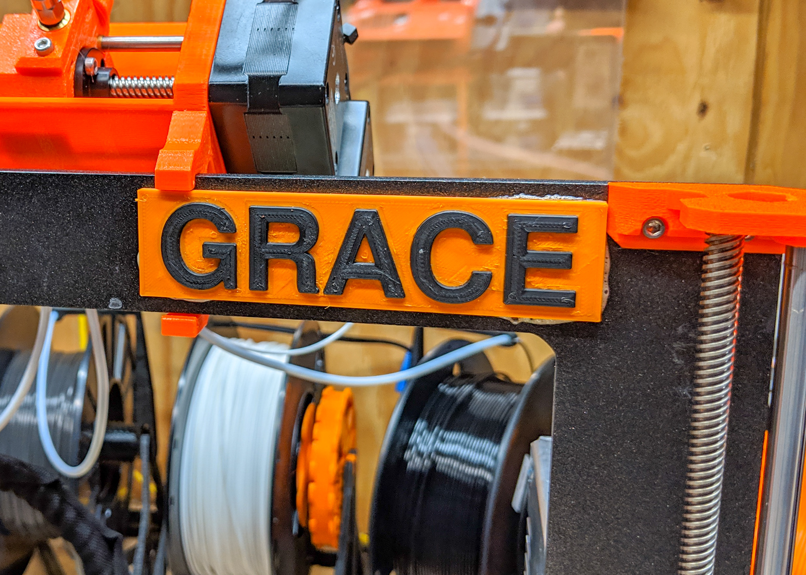
I finally put the nametags on my printers using this font, which is close enough for me:

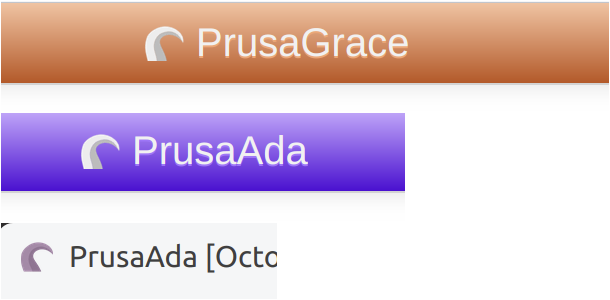
The colors match the theme color overrides in Octoprint so I can distinguish them:
Here's the thingiverse page with the scad and sample STLs:
https://www.thingiverse.com/thing:3559077
Re: what is the font of the PRUSA logo?
Not to be a buzz kill, but but make sure you've got enough clearance at max Z height. Z calibration that hits those at the top may cause problems. Consider clipping at the the very top and backs, and displaying the names above the frame.
I speak from experience... 🙂
Re: what is the font of the PRUSA logo?
Not to be a buzz kill, but but make sure you've got enough clearance at max Z height.
Yeah, I was watching for that. That's part of why 'Grace' has it centered (vertically) in the frame, which keeps it out of the way of the MMU2 hanger. They are flat enough that the Z height isn't affected- except when I had a clamp on it while the glue was drying and it was hitting the clamp.
Re: what is the font of the PRUSA logo?
Have you considered it could snag the filament sensor wire/connector if the printer goes to max Z under those?
RE: what is the font of the PRUSA logo?
I do not remember exactly how similar font is called but I've seen some similar fonts at https://fontsly.com/ . It is a simple Sans Serif Font. If you make a quick look you will probably find something you need.
RE: what is the font of the PRUSA logo?
I know I'm 10 months late to this thread - but I too was interested in the question.
I just chucked the Logo through "What the Font", which suggests the font is Neue Helvetica World 75 Bold
https://www.myfonts.com/fonts/linotype/neue-helvetica-world/75-bold/
Looks pretty close to me 🙂
RE:
The font this Freesans bold. Logo Design Company, creative logo show the correct picture of the brand
Link to suspect company removed by Joan. T (Moderator)
RE: what is the font of the PRUSA logo?
Hi,
the photo shows a match between a PRUSA Original Logo / signet and a Free-Sans, loaded from https://de.fonts2u.com/free-sans.schriftart.
the RED is the FONT.
It appears to be a good match, but the inter-letter-spacing would need a small adjustment.
RE: what is the font of the PRUSA logo?
This is the font used on their printed parts. Don't know if it's the same used here
Trust me, I'm an engineer 🙂 Always do your best. What you plant now, you will harvest later
RE: what is the font of the PRUSA logo?
Thank you, very clever to skim their sources.
I'll try both next time:
the helvetica as well as free-sans.
RE: what is the font of the PRUSA logo?
I bet the font is Helvetica Neue (bold), it's much more accurate than FreeSans (bold). It's 100% the one used in the Prusa Research logo but the text "ORIGINAL" shows that the "G" letter doesn't match that font... I don't know if they manually changed it or if it's really another font.
Cheers
RE:
I bet the font is Helvetica Neue (bold Text) , it's much more accurate than FreeSans (bold). It's 100% the one used in the Prusa Research logo but the text "ORIGINAL" shows that the "G" letter doesn't match that font... I don't know if they manually changed it or if it's really another font.
Cheers
RE: what is the font of the PRUSA logo?
I have worked with typography for 45 years. None of the mentioned fonts is exactly right, but the font is absolutely not Helvetica and not Free-Sans. The shapes are not right at all.
First of all, the Prusa graphic artist is using at least two weights of the font. "Prusa" is much heavier than "MK4" in the example below.
The closest I've found is Neue Helvetica at https://www.fonts.com/font/linotype/neue-helvetica
Here is why. I compared a 800x magnification of the Prusa front panel with Neue Helvetica 95 Black and 75 Bold, adjusting the cap height the same for all three. The stroke width, terminals, bowl, counter and stems seem near identical. Not exactly the same, but very close.
Professional multi-weight fonts are way to expensive for a simple non-professional project. I used the sample generator at fonts.com, with the browser page magnified to 300%. Good enough for a simple project.
Here is a comparison of the font panel with Neue Helvetica with 95 Black in green and 75 Bold in blue. If you adjust kerning and tracking it could be near identical.
