Tips for printing QR codes?
Any advice on what works/doesn't for QR codes? This one works for printability, but you have to hold it farther away than expected. However if I try to scale it down, I'm thinking it might be too small to print correctly. I also read in this thread that QR codes need to be dark on a light background. I'm not sure if that's what's affecting the readability, but hoping there are ways to make this work.
RE: Tips for printing QR codes?
Why would you want to 3D print a QR code.
Normally used as a reference for collecting or reading data.
A bit of a case of BS baffles brains, I think.
I hope you are not using 5 different colour filaments LOL
RE: Tips for printing QR codes?
Why would you want to 3D print a QR code.
Normally used as a reference for collecting or reading data.
A bit of a case of BS baffles brains, I think.
I hope you are not using 5 different colour filaments LOL
In this case, putting plain text is proving difficult due to size, so a QR code can take them to your website/LinkedIn page.
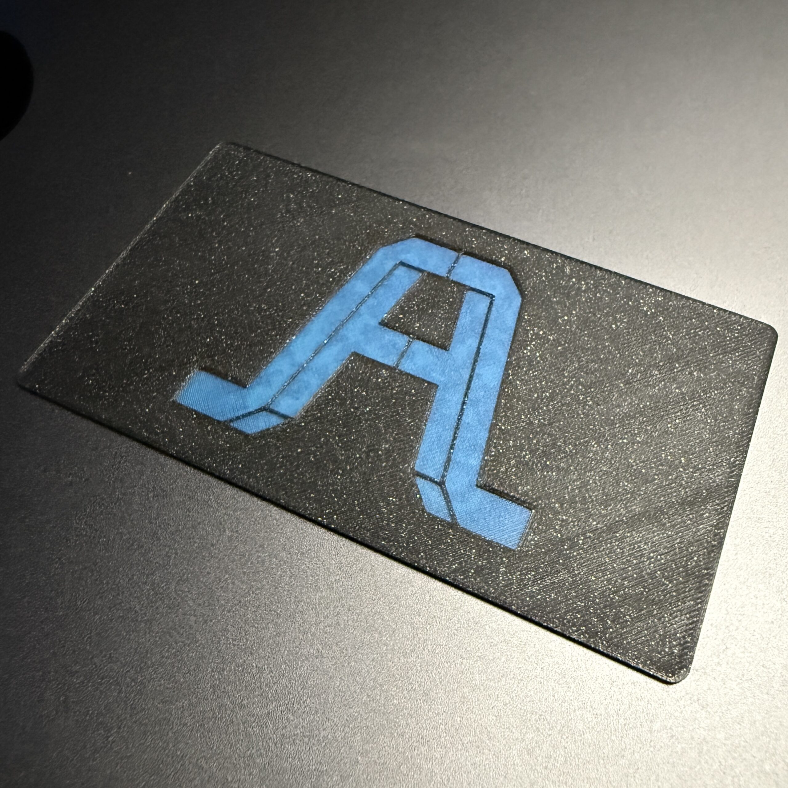
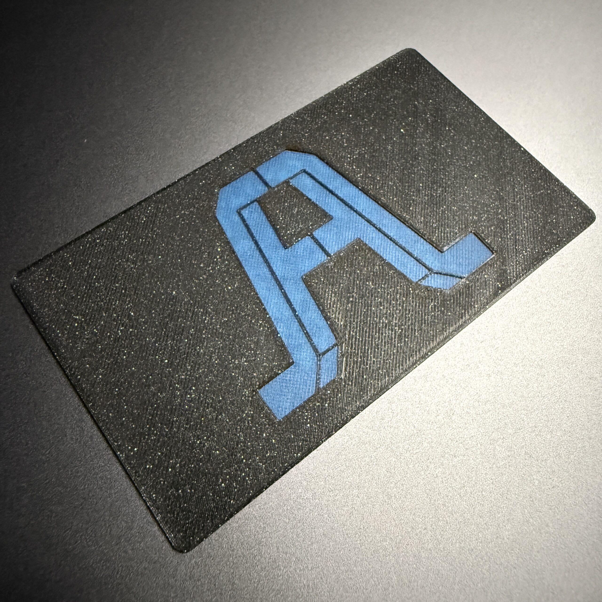
As far as colors, I'm currently using 3 😁 The front side of the card:

RE:
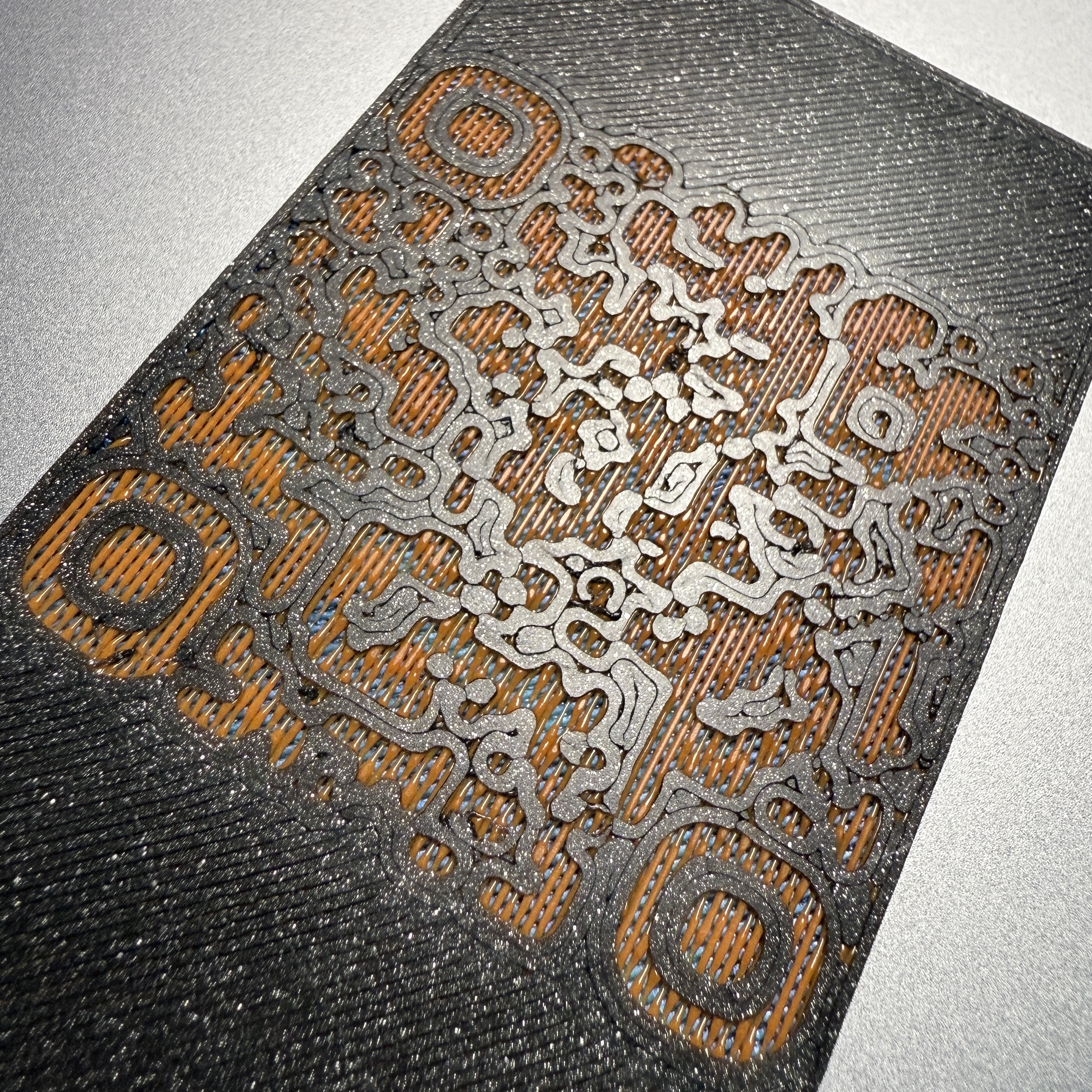
Unfortunately, trying to print the way you're doing with the QR design on the first layer is probably the worst scenario. Not saying it's not possible to get good results, but you're always going to be fighting elephant's foot for something that requires relatively sharp corners and fine details. Bed adhesion is absolutely critical, since any little touch has the chance of not adhering and just moving to be a blob for the next section.
I understand the want to have the main logo top-side up, but it might be worth flipping it and making sure the bridging behind the logo has enough thickness to fill out the background.
Regardless of orientation, this one should be fairly obvious -- switch to a 0.25mm nozzle. Finer detail, sharper corners, less issues with elephant's foot since there's less volume to deform.
To combat the window-blind look of the bridging behind it, you could try using thick bridges, or doubling up on the layers before the next color transition (though I realize this will be limited by the physical requirements of the card thickness).
If you have multi-color capabilities, the true solution to all of this would be to instead of using empty space and different colored layers, to just print the light spaced area first on the bottom layer, then continue to fill in the darker sections (specifically in this order, due to how QR code readability works -- the lighter color will tend to spread out first, and the darker color will fill in the smaller areas, so instead of the dark areas being squished out, they're all confined in the exact grid for readability purposes).
It's actually possible to achieve this without an MMU, but it requires a bit of trickery and minor editing of gcode. Basically, have the light section as its own object, aligned with the main print as a separate object (the slicer will probably get annoyed at overlapping paths, but it should still allow you to slice). Make sure when slicing that the light section's object prints first. Export the gcode, then find the point at which it starts with the main object (it should have a comment referencing the object name). Right before it does the switch, add an M600 line to change filament, and you're good to go.
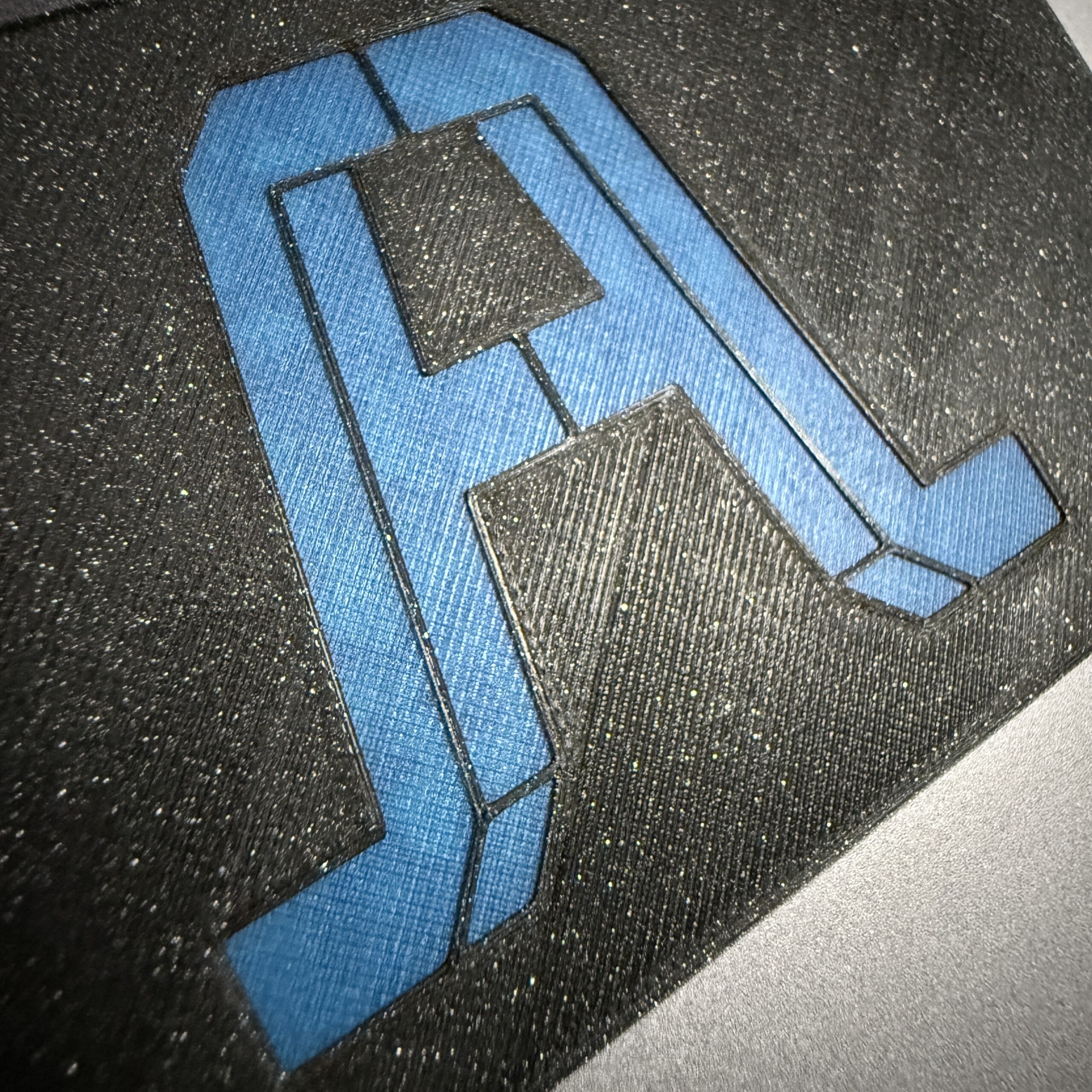
Edit: oh, one final thing. Surface texture and patterning also goes into readability. For best results, use flat-colored filament (not galaxy black, because sparkles), and a satin sheet.
RE: Tips for printing QR codes?
Thank you for the insightful reply. These are all great tips I look forward to testing out to see the result. Appreciate you taking the time to help figure it out!
RE: Tips for printing QR codes?
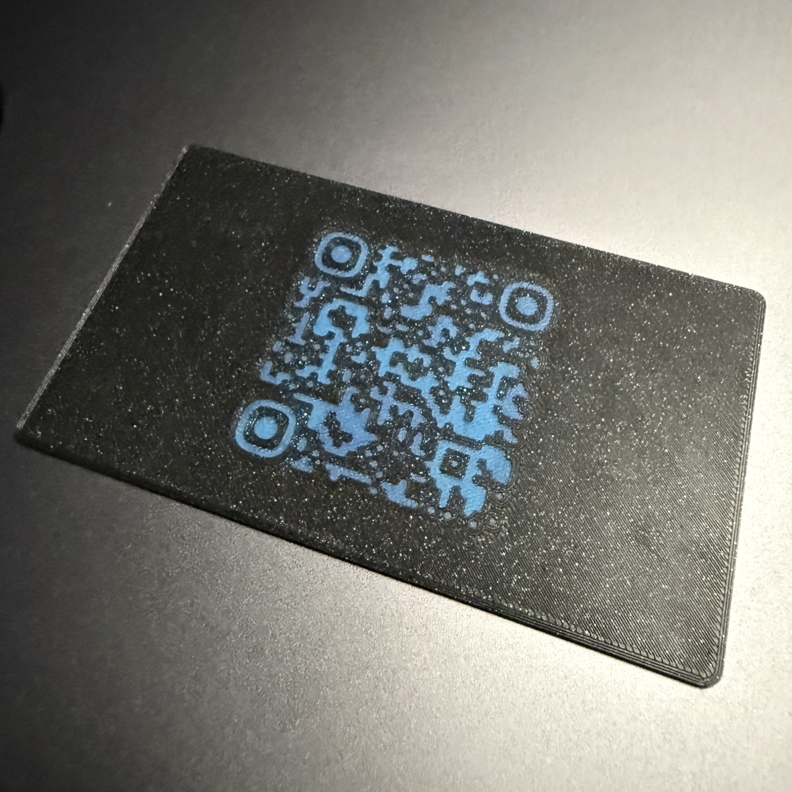
0.25 nozzle is your friend! Combined with "Single perimeter on first layer" and "Hilbert Curve" for the first layer infill.
It's like tattoo'ing the print sheet via the nozzle.
Satin sheet would be the way to go, OR you could use an old smooth sheet and rough it up with sandpaper. I'd refommend using a sanding block and starting with 1000 grit in all directions to give it some base roughness, without a visible pattern. Then doing just 45° strikes with 400 grit, giving it some "brushed steel" look.
I did some quick & dirty job on a really banged up mk3 smooth sheet, using 400 grit sandpaper without a sanding block and chaotic movements. Surprisingly, prints have some nicely matte look and it's by far the stickiest sheet in my collection. Really nice for sharp patterns on the first layer with the small nozzle.
RE: Tips for printing QR codes?
0.25 nozzle is your friend!
Thanks for this @raax-2 ! Really like the results I got out of the smaller nozzle. 0.05 Detail print profile:
RE: Tips for printing QR codes?
Nice! Thanks for reporting back, looks great.
Did you try Hilbert Curve for the first layer bottom infill?
Regarding your last picture: I too have these random lines and didn't find out how to get rid of them yet..
RE: Tips for printing QR codes?
Not yet, but will try in the next run!