Sign Project, Seeking Clean Background, True 100% Infill?
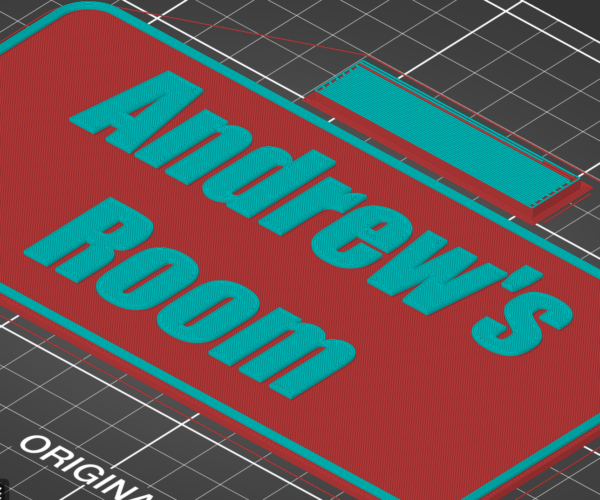
I'm trying to print the attached sign. The issue I'm running into is that even when setting the infill to 100%, on the layer that precedes the building up of the letters, PrusaSlicer builds all of these little slots into that layer, that result in a lot of streaking around the letters. I'd like the layer just under the letters to run as a single extrusion, zig-zagging from one corner to the opposite one, to make a really clean surface for the letters to sit on. I thought 100% infill would fix that, but it still builds the little slots in. Any advice would be greatly appreciated, thanks much.
Best Answer by Neophyl:
@nightengale
I've added a height range modifier for that layer below where the letters start. It wasn't as straight forward as I thought actually as it isn't the infill that its using, its the fact that the letters are above and it tried to connect the infill in the middle which normally gives better strength. In this case though it doesn't make any difference. That layer is technically a top layer so no matter what settings for infill are changed it doesn't apply as its topfill.
I take it you didn't like the apparent different in light from that layer given that it lays down from different directions ? With the new version coming out (can test it on the alpha release) it has a new infill type called Monotonic which lays down in the same direction so should sort this type of issue out.
However as you aren't using an alpha build I had to trick it into doing what you need.
The attached project has the modifier applied to it (you can see it in the object panel when you click on it). By setting top and bottom to zero just for that layer it makes it use the infill settings and that seems to be enough in this instance.
Steve's suggestion of using a really high perimeter count for that layer actually gives a nice effect too. If you want to look just change the perimeter count in the modifier to something like 200.
RE: Sign Project, Seeking Clean Background, True 100% Infill?
It shouldn't matter if you have enough layers of the top color. Probably need at least 3-4 layers. 6-8 would be certain to work.
You could also set the perimeters to a really high number like 100 so there is no infill needed.
Steve
RE: Sign Project, Seeking Clean Background, True 100% Infill?
Just add a modifier and set the layers below to 100% infill. Post your project here and I'll show you how if you like. (File>Save Project, then zip up the .3mf file or the forum wont accept it).
RE: Sign Project, Seeking Clean Background, True 100% Infill?
@neophyl
I've never added a modifier... Thank-you! (the design file is attached)
RE: Sign Project, Seeking Clean Background, True 100% Infill?
@nightengale
I've added a height range modifier for that layer below where the letters start. It wasn't as straight forward as I thought actually as it isn't the infill that its using, its the fact that the letters are above and it tried to connect the infill in the middle which normally gives better strength. In this case though it doesn't make any difference. That layer is technically a top layer so no matter what settings for infill are changed it doesn't apply as its topfill.
I take it you didn't like the apparent different in light from that layer given that it lays down from different directions ? With the new version coming out (can test it on the alpha release) it has a new infill type called Monotonic which lays down in the same direction so should sort this type of issue out.
However as you aren't using an alpha build I had to trick it into doing what you need.
The attached project has the modifier applied to it (you can see it in the object panel when you click on it). By setting top and bottom to zero just for that layer it makes it use the infill settings and that seems to be enough in this instance.
Steve's suggestion of using a really high perimeter count for that layer actually gives a nice effect too. If you want to look just change the perimeter count in the modifier to something like 200.
RE: Sign Project, Seeking Clean Background, True 100% Infill?
RE: Sign Project, Seeking Clean Background, True 100% Infill?
@neophyl
So much good info here, thank-you. Haven't re-printed yet but in slicer it looks like its laying down the plastic how I was wanting. I wasn't aware that the direction the filament is being laid in changes how the light reflects off of it. Totally makes sense though. Will be looking for that feature in the new release, this will work great in the time being. Thank you so much again.
RE: Sign Project, Seeking Clean Background, True 100% Infill?
@steve-16
Appreciate the response. Af first I didn't understand but now I get it, thanks so much.
RE: Sign Project, Seeking Clean Background, True 100% Infill?
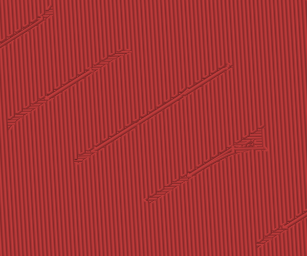
One more question if I may, I'm seeing some infill gaps in the top layer (see picture) -- any ideas on a setting to resolve this?
RE: Sign Project, Seeking Clean Background, True 100% Infill?
Detect thin walls in Print settings (Advanced settings) may help. I see the same problem in some of my prints.
Have a look at my models on Printables.com 😉
RE: Sign Project, Seeking Clean Background, True 100% Infill?
@neophyl
THANKYOU so much for this solution.
Using your idea it got me close but my model still had a few spots where the top layer was incomplete.
I had to enable solid infill every 1 layer and set 100% infill plus the range modifier you suggested then set the main layers to 0 top layers.
In simplify 3d I would just add a process and set the layer heights and select solid infill. I love this slicer just needs a simpler option to add solid top layers if needed.
RE: Sign Project, Seeking Clean Background, True 100% Infill?
That "ew" print looks under extruded. What printer is it? What material?


