misaligning colors
I'm trying to print white PLA text on/ in a black PLA item.
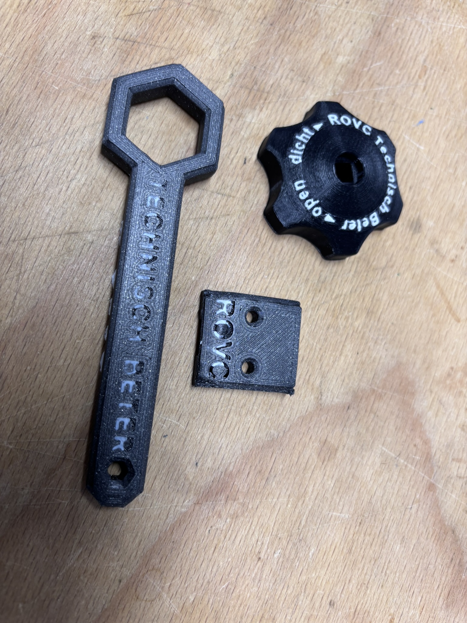
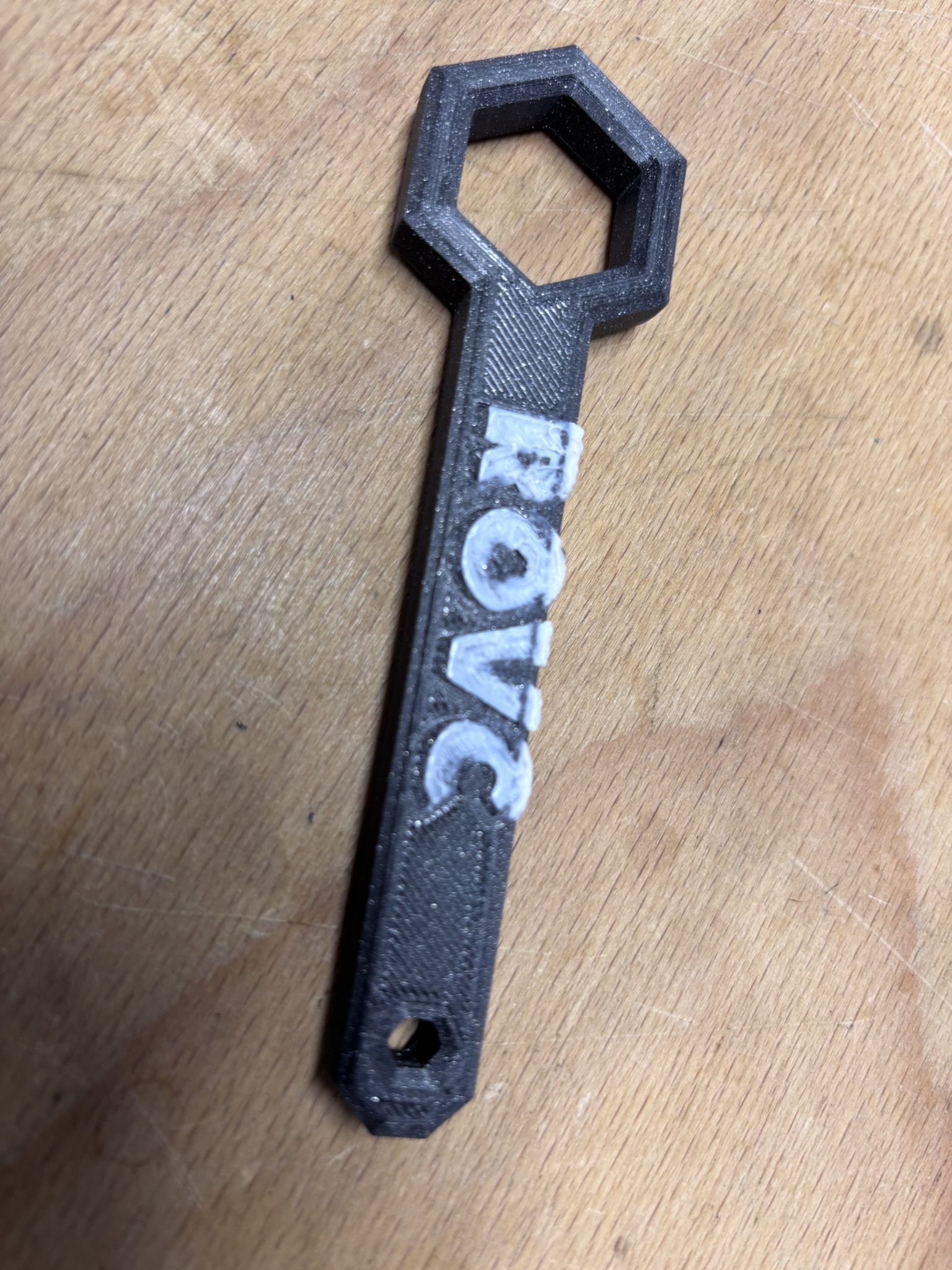
On the build plate side the printer leaves gaps in the text ('technisch beter') and on the upper side the text ('ROVC') is (rather smeared then) printed out of place.
It used to print such items perfectly as can be seen in the knob beside the misprints.
I've already calibrated everything a thousend times and tweaked and turned every parameter, but still with unsatisfying results.
Thickness of the text is 0.5 mm and the layerthickness is 0.10 mm (Fast detail)
What went wrong and how can I fix this?
Best Answer by Diem:
That is neither of the parts that were causing you problems upthread.
It is not well designed for 3D printing, it seems to be patterned on a part designed for drop-forging. Although set to print support enforcers none have been defined ... and as designed you would need plenty.
The recess on the bottom is going to be a nightmare to support together with the unsupported text; better to leave the underside flat and to improve the readability set just one perimeter for top and bottom layers.
The main top layer text is sized to two extrusion widths per stroke and should print OK as should the '20' numbers but the '24' glyphs are enlarged just enough that short insert lines and dots are required to fill the space and it will look messy.
The 60% grid infill isn't going to help much, I would use cubic fill and probably reduce the density but add a couple more perimeters for strength.
Cheerio,
Gaps in the text are common when the text size is small - the effective printing resolution, the 'dots per inch' of a 0.4mm nozzle is around 56, your dot-matrix or laser printer probably describes anything under 300 dpi as draft quality and defaults to something at least double that...
So: 10mm high, roughly 40 point text, on your XL will print as clearly as 3 point text on your 720dpi dot matrix.
Any smaller text requires careful choice of fount; you need one where all the strokes are the same weight and then select a size where those strokes are represented by simple multiples of your extrusion width.
If you want us to diagnose the displaced and smeared text save your project as a .3mf file
Files > Save Project as
Zip the .3mf and post it here. It will contain both your part and your settings for us to diagnose.
Cheerio,
RE: misaligning colors
Thank you for your reply.
The text on the knob is much smaller and printed perfectly, so I don't think is just the font size.
Je can also see that the upper half of the text leaves the gaps.
The text on the upper side ('ROVC') is even bigger but printed with an offset. You can see the outlines printed in black.
The text on the knob is much smaller and printed perfectly,
So use the same fount and the same size and it should also print OK.
Zip the .3mf and post it here. It will contain both your part and your settings for us to diagnose.
Cheerio,
RE: misaligning colors
Okay, curious if find something
Gr. Dennis
That is neither of the parts that were causing you problems upthread.
It is not well designed for 3D printing, it seems to be patterned on a part designed for drop-forging. Although set to print support enforcers none have been defined ... and as designed you would need plenty.
The recess on the bottom is going to be a nightmare to support together with the unsupported text; better to leave the underside flat and to improve the readability set just one perimeter for top and bottom layers.
The main top layer text is sized to two extrusion widths per stroke and should print OK as should the '20' numbers but the '24' glyphs are enlarged just enough that short insert lines and dots are required to fill the space and it will look messy.
The 60% grid infill isn't going to help much, I would use cubic fill and probably reduce the density but add a couple more perimeters for strength.
Cheerio,
RE: misaligning colors
Thanks for your reply again,
Although helpful, I see I added the wrong file.
This one is in the picture above.
If you have the time, please shine your light on this one:
Again that is not exactly the same file, I suspect you have been refining the design. It was not exported from PrusaSlicer so your settings are not included; I will assume they are as above.
As defined it will make a weak part but in your pictures you appear to have rotated it flat into a better orientation for strength.
The text size is as above and should print OK, I can see nothing that would cause the offset smearing ... but you have broken the text into individual character placements that could make it harder to accurately adjust placement on the bed.
There are a couple of tiny oddities in the original file, the slicer reports a need to move outside the print area then appears to ignore it which suggests there is a fragment part, probably tiny, some distance from the main part. It is just possible (I can't find it) that the printer is trying to reach outside the bed to print this causing a crash and layer shift - 'though I doubt this.
And there is what appears to be an extraneous dot, also tiny, just after the main text that is causing a small, circular, functionless perimeter on the top layer.
These suggest that your design software is leaving fragments (from your editing?) in places where they are causing unplanned effects.
But I also wonder if your main issue is a matter of calibration. When you said you calibrated everything, did you include:
https://help.prusa3d.com/article/multi-tool-manual-calibration-xl_470560
?
Cheerio,