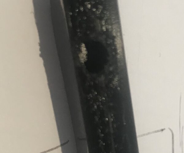
ugly surface above supports
Good morning everybody,
I'm still fighting with some parts of my maybe overly ambitious project. This time it is about the attached part. It prints reasonably well but the surface of the tube that is next to the supports looks rather rough and somewhat ugly.
This going to be a part for a ceiling lamp, so most likely nobody will see this bit, but I know it's there and would like to learn how to make it any better. The picture isn't the best, but as good as it gets without using a proper camera.
Any suggestions? I'm reluctant to print it upright because that would move the supported surface to the bottom where it would be more visible and also I assume that even with a huge brim the whole thing would likely topple before it finishes.
Thanks in advance
RE: ugly surface above supports
Surface printed on top of support aren't going to look great unless you're using dissolvable supports, at least not with current consumer-grade FFF 3D printing technology. In order for support to be removable, there has to be a gap between the support and supported layers. This means the layers immediately atop support won't have any "squish" onto the underlying layers, so will be round extrusions with a bit of sagging. You can work to minimize this, but it will always have that "stringy" look. Better is to re-orient the part to minimize the need for support, if possible. If you are designing the part, you can add support or cut parts apart to reduce supports. Avoid fillets and rounded edges on undersides and use chamfers (angles) instead.
and miscellaneous other tech projects
He is intelligent, but not experienced. His pattern indicates two dimensional thinking. -- Spock in Star Trek: The Wrath of Khan Unfortunately,…
RE: ugly surface above supports
gnagnagna, I hate it when people that are smarter and more experienced than myself confirm my suspicions 🙂
Thanks a lot bob, although I was hoping for some magic your comment helped understand the whole thing better.
